Video is becoming very popular these days. More and more organisations, companies and individuals are producing ongoing video content, but might not follow a video style guide.
Video content is an essential part of a brands communications and messaging. Just like any other assets, whether it’s print or business cards, you want your design, colours and fonts to align and be consistent.
When a brand doesn’t follow a specific style-guide, or is using many different shades of a particular colour through their branding, the audience can tell. But they might not directly understand what’s wrong with the branding, they just see that something isn’t right, which directly devalues your brand.
That’s why consistent branding is a must for any organisation, company or individual. Let’s talk about what branding actually is.
Logo
Branding starts with a logo – a logo consists of a scheme of colours or just one colour, a font and shapes which determine the look and feel of the logo.
For example this is our Studio Orange logo and it’s shapes, font and colours:
![]()
Colours
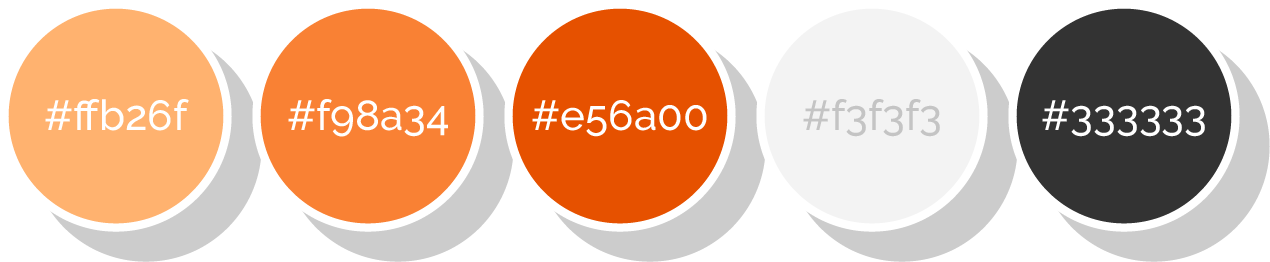
Next to your logo and its set colours, a brand has a set of supporting colours to use through collateral, which can be anything from business cards through to flyers, signage and promotional material.
Here is an example of our colour palette:
Fonts
Most brands have a set of fonts they use in their assets, usually there is a main font and a supporting font. There are also some rules around sizes and when to use each font.
Video Style Guide Explained
Now that you have an understanding of branding and its function, let’s talk about branding for videos. A video style guide determines the use of motion and decided on certain patterns in videos.
Branding for videos needs to follow the guidelines of a style guide and add a pattern of motion into it because video consists of moving images.
There are several visual branding elements that can come into video production, these can include:
- Logo Animation (example)
- Intro and Outro slides or Bookmarks (example)
- Animated Titles (example)
- Lower Thirds (example)
- Transitions, including shapes or basic transitions
There are also language and tone related elements that can impact your video communication:
Tone:
Do you allow video content that is more conversational or is your content serious or educational or sales-focussed and how do you communicate on which platform.
Language:
What type of words and phrases do you use?
Audio:
How can you design the sound of your video communication to be recurring and memorable and what feel do you want your audience to have when they hear it. You might follow the same opening jingle each time, or use audio to dictate a certain feeling for your audience for example: sad, excited, innovative, upbeat etc.
Video is a popular way of communicating a message in the marketing and digital world, but there definitely are some pitfalls and some things to avoid and do right to do your brand justice.
That’s why we recommend our clients to create video style-guides.
Style-guides are custom designed and can be a specific description about what each element looks like. It can also include a set of animated After Effect file templates, which can be duplicated for each use to suit the product or output.
Have a look across our website and video content to see how we make sure our branding is consistent across different media and platforms.